Brand for the town of Dvůr Králové nad Labem
We have prepared a new brand and visual communication for Dvůr Králové nad Labem. The town has acquired a memorable and long-lasting brand that will not fade away and at the same time will stand up to changing trends.
Account Manager: Michaela Kurtaničová
Marketing Specialist: Jana Varnerová
Brand & Design: Ivan Kebeleš
Town of Dvůr Králové nad Labem
The town is located in the Hradec Králové Region and has 15 thousand inhabitants. It has a strong historical tradition, its centre is a conservation area. One of the most attractive Czech tourist destinations, a zoo with a safari, is located on the outskirts of the town.
Client’s requirements and our role
The town launched a public tender for the project of creating a communication strategy and a new visual style. The basis of the project was an in-depth analysis of the existing communication. This was followed by the creation of communication strategy of the town and then the design of a new brand and visual identity. The entire project, from analysis to implementation of the brand, was created in our agency.

Logo & brand
We designed the new brand based on an extensive analysis.
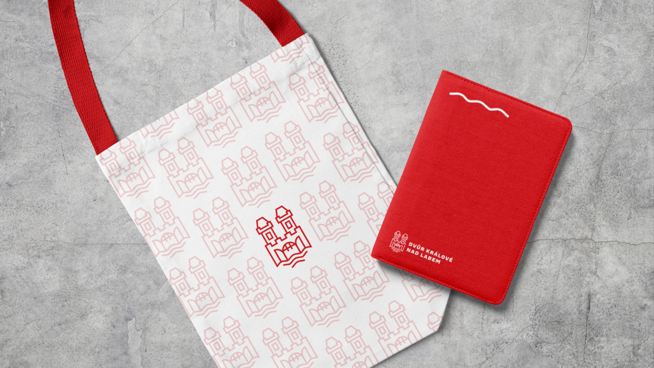
The new identity of the town refers to a strong historical tradition. According to surveys, history is one of the most characteristic attributes of the town. When creating the logo, we used the original coat of arms and gave it a modern look.
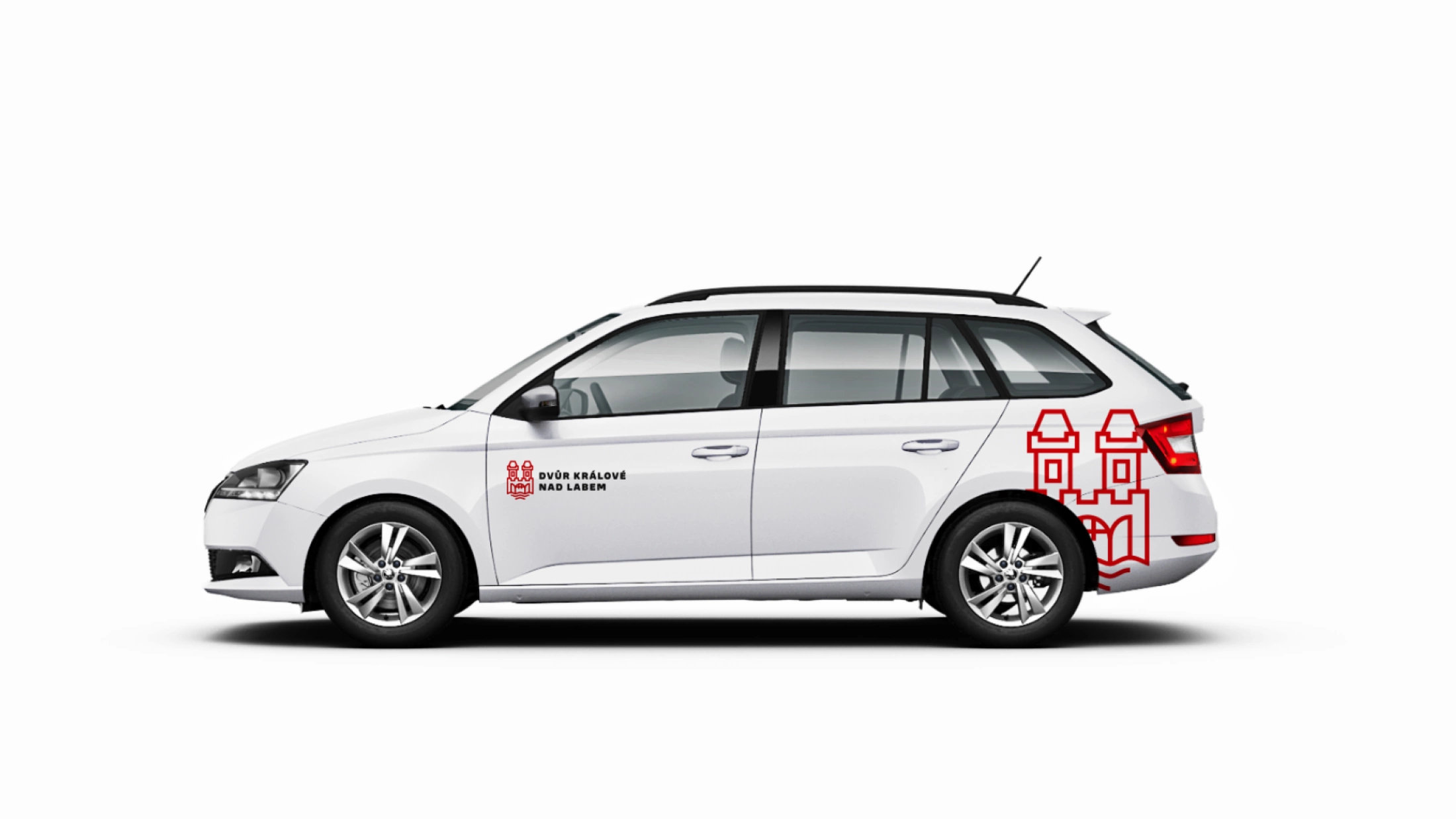
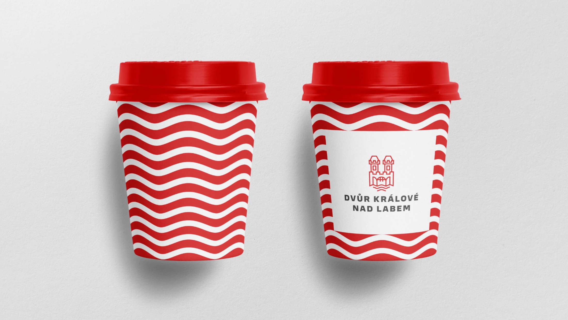
The logo is made of a stylized shape of the town gate together with the name Dvůr Králové nad Labem. The second distinctive visual element of the identity is a wavelet, which represents another characteristic feature of the town – the Elbe river basin. The town thus gained a memorable and long-lasting visual communication, which will not fade away and at the same time will stand up to the influence of changing trends.

Colours & typography
As the main colour of the town we have chosen “Court red“, complemented with “Court Grey“. The red colour follows the original colour of the municipal coat of arms and thus emphasises the historical roots of the town. For both colours, we have created fixed colour ranges so that they can be easily and elegantly combined.
As the main font for print, headlines and slogans we have chosen Loos Normal. A complementary font to be used especially for online communication is Tahoma.
As the analyses showed that the town should distinguish between communication towards citizens and communication towards tourists, a complementary green palette for tourism was also created.

Application and new brand in practice
We prepared a comprehensive visual identity manual. In it, the town representatives will find an overview of the graphic elements as well as examples of how to use each element. The manuals include instructions for the use of each graphics. We attached graphic templates to the manual that the town employees began using immediately in practice.
To make the transition to the new look as smooth as possible, we organized a workshop on how to work with the new brand and how to implement it into the normal running of the town. During the first few months after the new features were introduced, we provided feedback to the town employees, as well as regular graphic consultations.

Printed materials, merchandise and outdoor
As part of the new identity, we have prepared a template for the typesetting for the town hall newspaper which regularly informs the citizens about what is happening in the town. The redesign also took place as concerns daily used printed materials such as folders, envelopes, business cards, greeting cards, diplomas and letterhead.
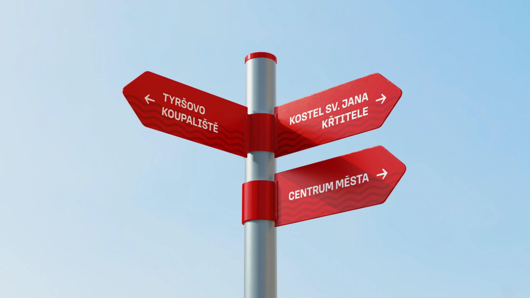
We prepared a proposal for new souvenirs for the town such as T-shirts, bags, pens, mugs, badges, key rings and patches as well. In the concept of visual identity, we also thought about the outdoors, so new flags, directional signs, navigation elements, railings and other furniture may be built in the town.

Online communication
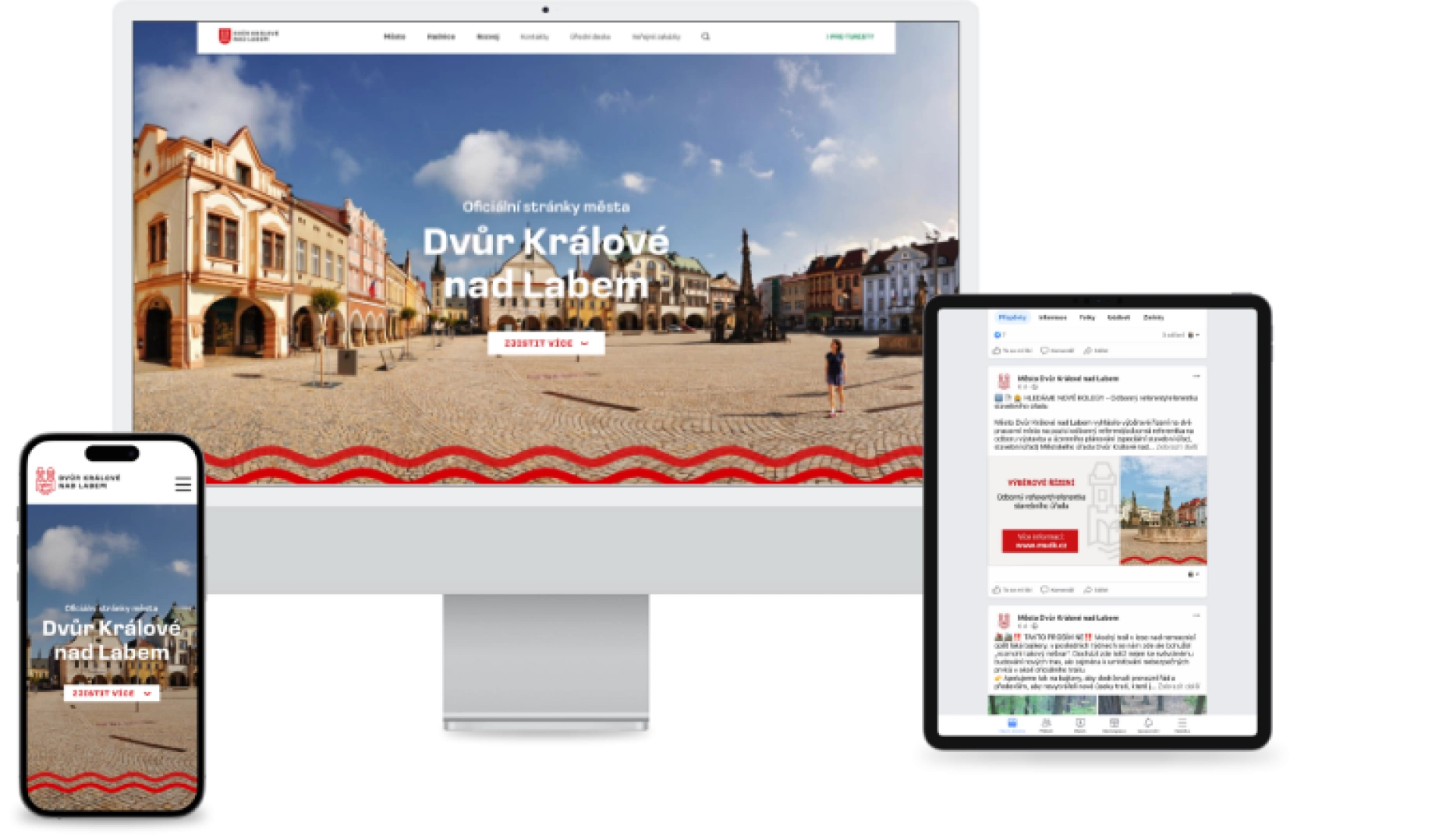
Visual elements were also reflected in the town’s online communication. We prepared templates for contributions to social networks and examples of how to use them for different types of content. The e-mail signature of all town employees has also been innovated.
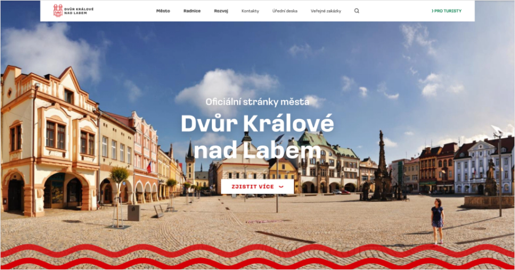
The new brand should serve the town in the long term, so we also thought about future projects. That is why we prepared a concept of the website design. If in the future the town considers redesigning the website, it can build on our proposal and easily develop a new website design.
Illustration
I evaluate the cooperation with the agency as very beneficial. The agency team was very professional. The Unified Visual Style Manual provides us with a clear framework for using of the newly created logo and branding, colours and typography, and the graphic manual includes specific instructions, examples and templates.
Jan Jarolím, Mayor of Dvůr Králové nad Labem
