Website for Střechy Comax
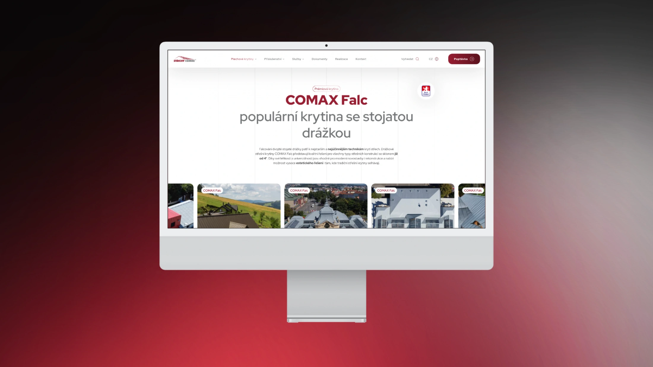
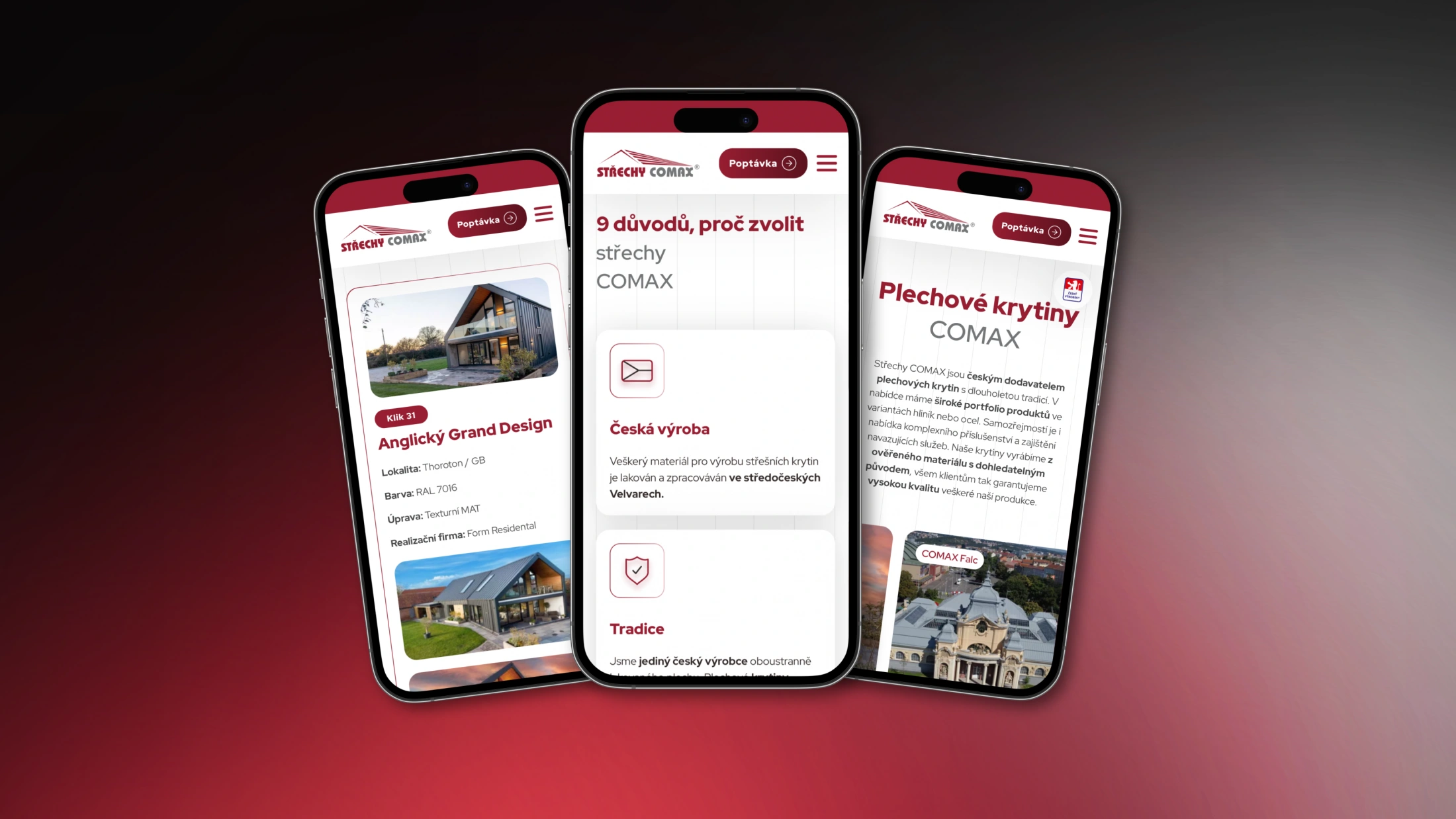
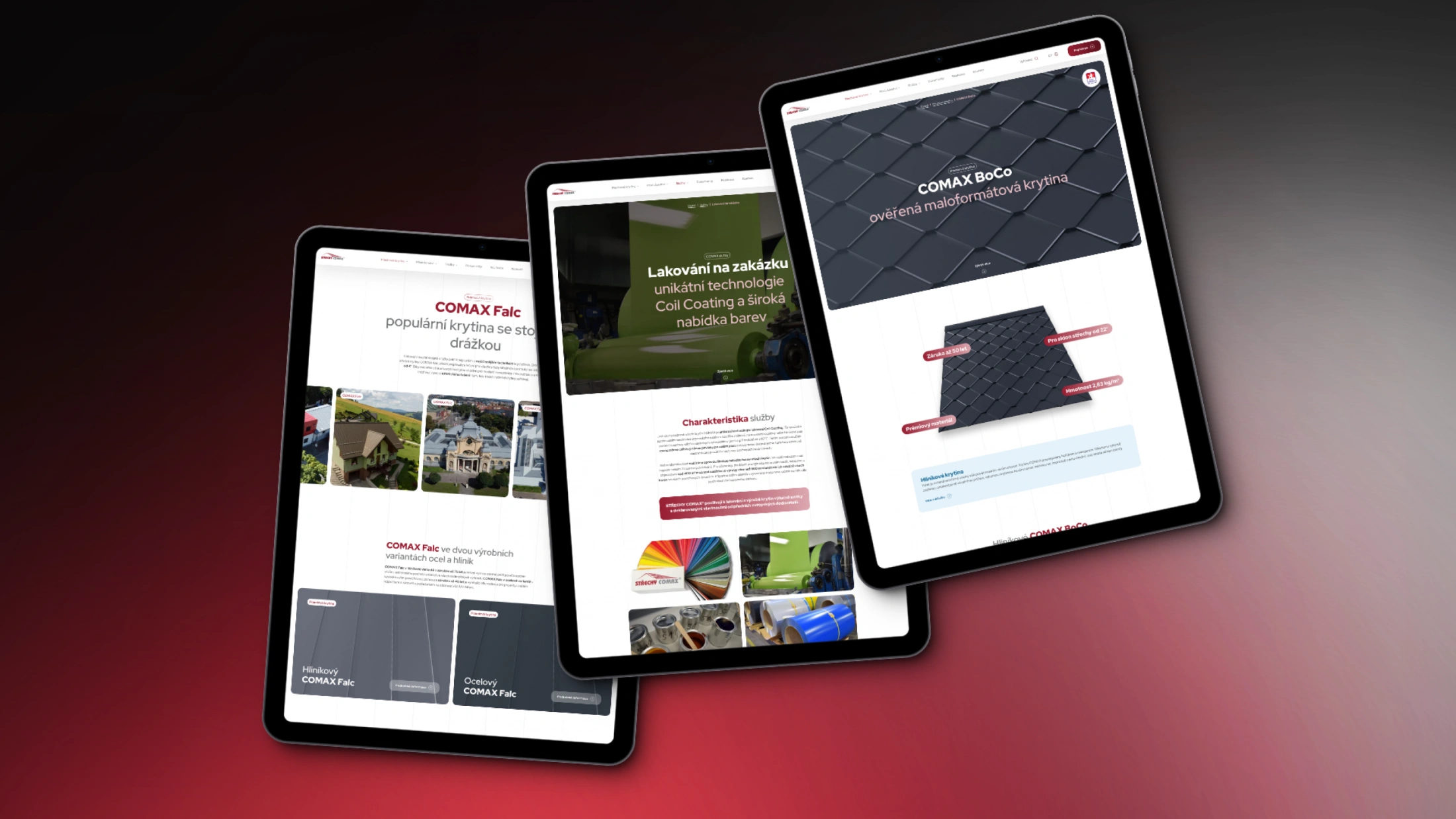
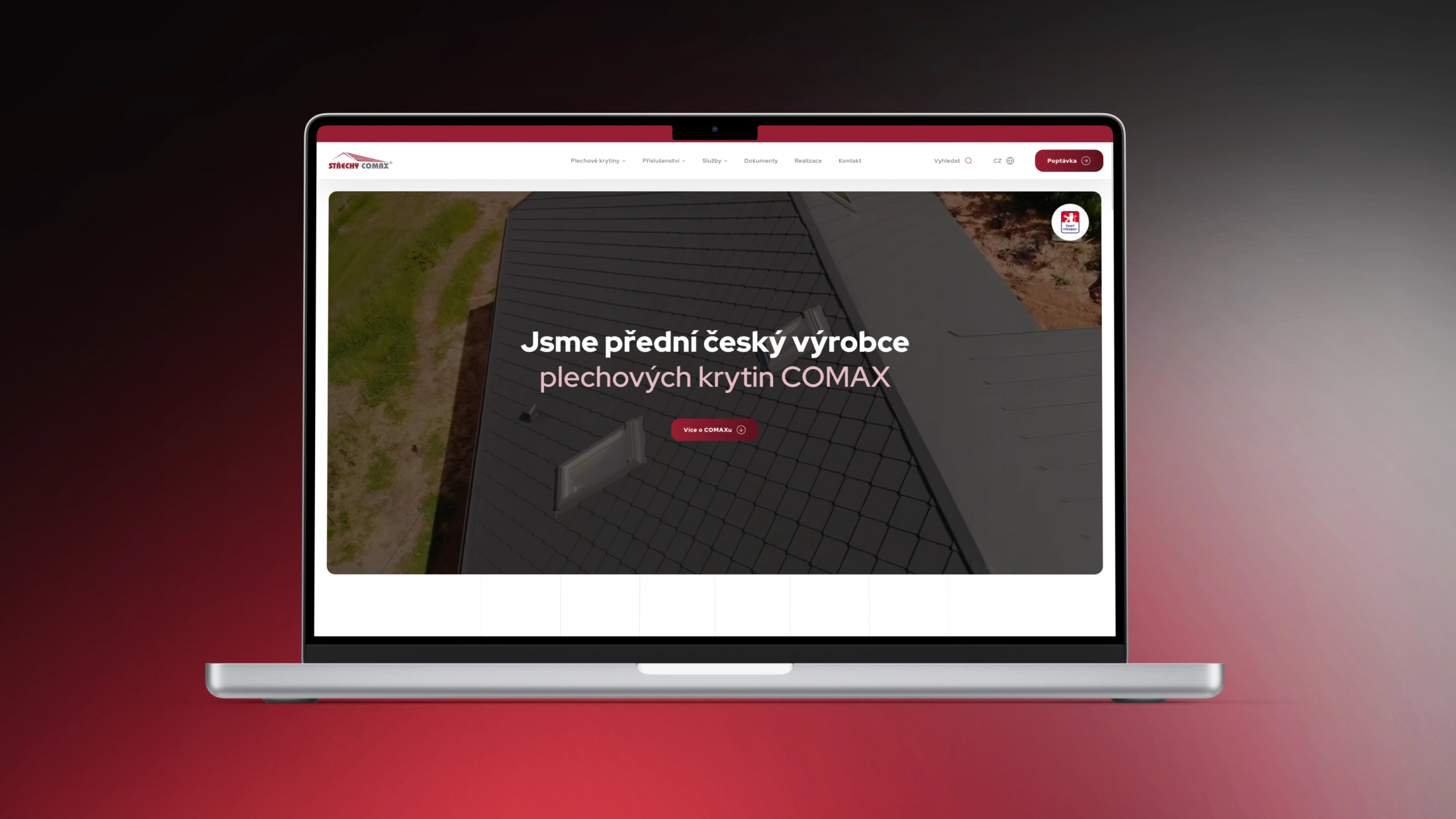
We created a comprehensive website redesign for roofing manufacturer Střechy Comax, which takes into account technical requirements, is well structured, clear and easy to navigate on mobile devices.
- Project management, UX: Jana Varnerová
- Graphic design, UX: Ivan Kebeleš
- 3D visualization: MadMenMedia
- Backend: Jan Polzer
- Frontend: Lukáš Polzer
- Content: Střechy Comax + Jana Varnerová
Střechy Comax
Střechy Comax is a traditional Czech manufacturer of metal roofing in the Czech Republic. It operates under its own brand as a separate division of the parent company Metal Trade Comax.
Client brief and our role
The client approached us with a request for a website redesign. The original site was created in-house and did not meet quality or technical standards from the current perspective. Our task was to provide a suitable technical solution, new structure, information architecture, design, content consultation, coding and subsequent testing.

Initial situation
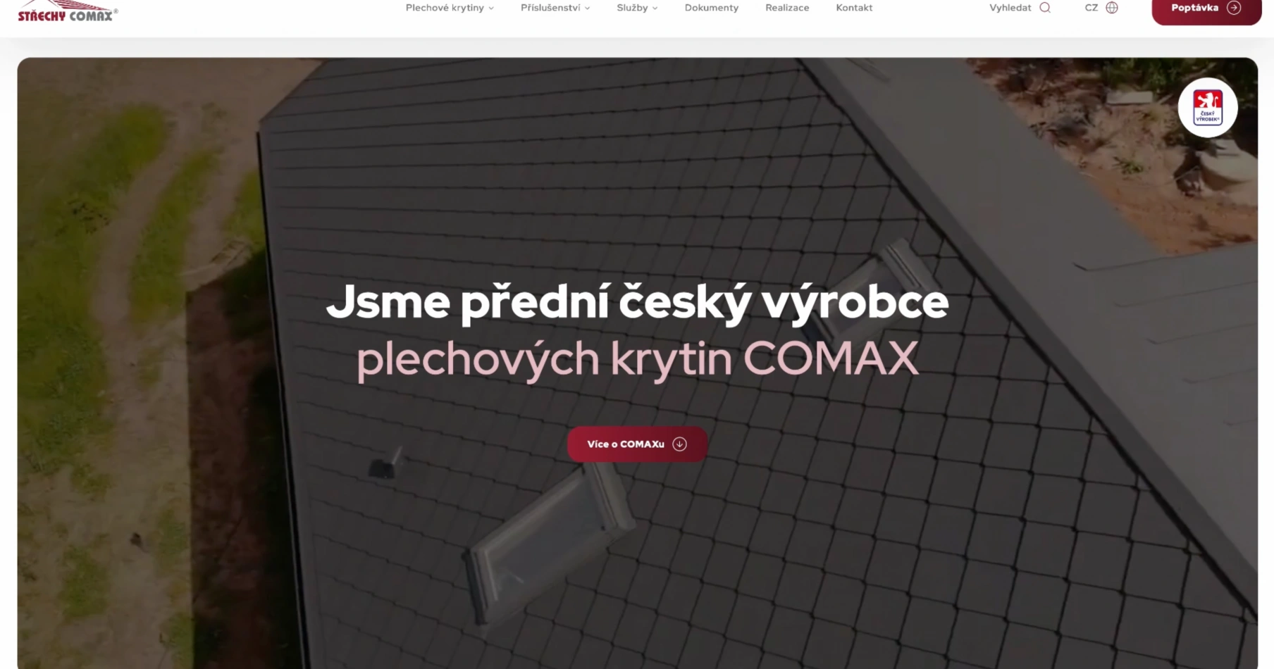
Střechy Comax is one of the leading manufacturers of metal roofing in the Czech Republic. It places maximum emphasis on quality and a superior portfolio of related services. However, the original website did not correspond to this positioning. In addition to the outdated design, the website had become less clear over the years, overloaded with information and a lot of mainly technical texts.
The main goal of the new website was to highlight the simple and clear structure of the presentation of products and services with an emphasis on the visual aspect and quick retrieval of required information.

Analysis
The target group of the website is primarily B2B entities such as building supply shops, architects and craftsmen, for whom it is important to be able to easily check basic product details, and find relevant documentation and information on delivery times. It was therefore an important task for us to effectively sort the available information about individual products and services and to design a completely new way of presentation, taking into account the significant variability of the basic products.
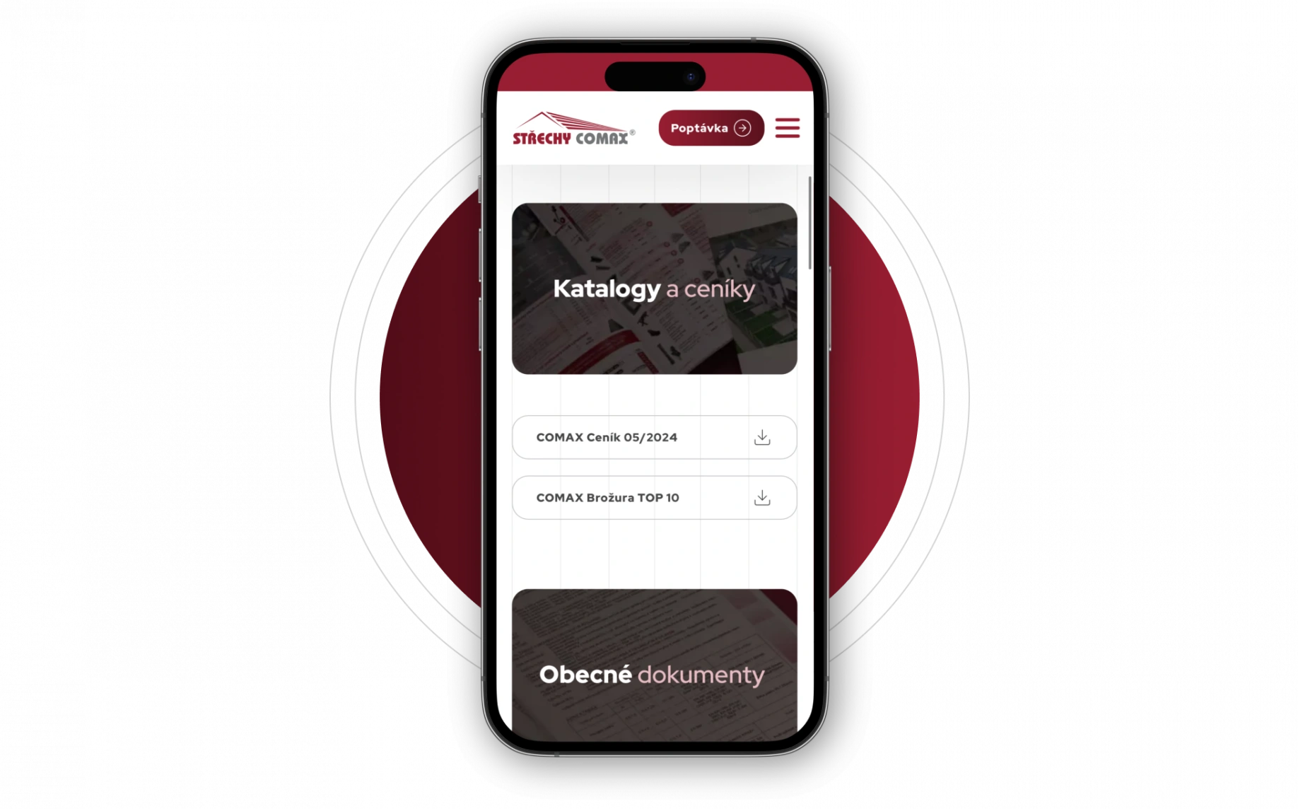
Based on data from Google Analytics and consultations, we knew that the website is completely dominated by traffic from mobile devices, which has been around 80% in the long term. All further steps had to be set so that the new website would meet user expectations as much as possible.
Emphasis on graphics
The weakness of the original website was not only the overall graphics and UX, but also the minimal emphasis on the visual presentation of individual products.
For the purpose of communication, the client has a defined logo and colour scheme, which we used as a basis for creating the graphics. We focused on two key things in particular:
- shifting the perception of the brand from a technicist concept to quality and image in order to support the desired brand communication;
- visual aspect of product presentation from previews to final implementation.

3D visualization and accuracy
This resulted in a set of 3D visualizations that show specific products arranged in a preview area. Each visualization can easily be associated with a list of key product features. The 3D theme of each product is then reflected in other navigation elements across the site, such as tiles. Thumbnail previews were also used as filters for sorting reference projects. The entire website is underlaid with a subtle lined background, which evokes a standing seam roof.
In addition to visualizations, the website also contains a number of photographs, icons and drawings. All photographs were taken from the client’s sources, while additional graphic elements were custom-made for the website. The presentation of each product includes key documentation, technical specifications, colour samples, as well as presentation of finishes and accessories. We paid great attention to the attractiveness of the reference presentation.

Structure and UX
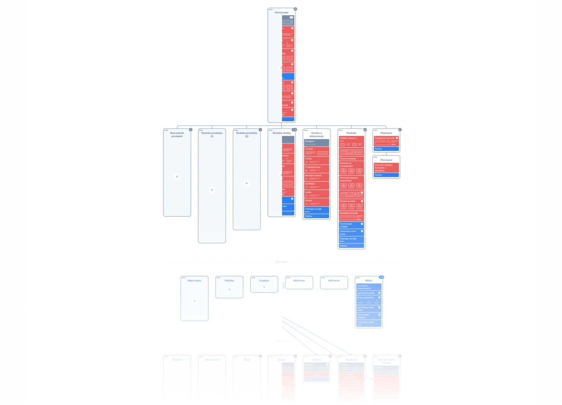
The design of the information structure was created using the Octopus.do tool, and the complete design and UX was made in Figma. Client representatives from the marketing and technical departments also had constant access to both tools. All visual and content proofing took place directly within the two tools, from where the developers and coders gradually collected the data during the implementation phase.
A key element of the new structure was the overall simplification of the website and the removal of content duplication, making the structure clearer and facilitating the retrieval of important information, attributes and documents.
Content attractions
Although the website is primarily intended for the B2B segment, we know that it is also visited, albeit to a lesser extent, by end customers who actively make enquiries. For these visitors, we have created a clear guide to choosing a roof that will help potential members of the general public to define the right requirements for their project.
Comax Roofs also holds regular training courses for tinsmiths and vocational schools, so we have prepared a content section dedicated to them with the option to easily register for a specific type of training on a selected date.

Administration, enquiries and language versions
We recommended to build the new website on Drupal platform. At the client’s request, we connected it with the existing enquiry management system, which takes into account the regionality of individual businesses.
Comax Roofs also operates in Germany and the UK. Although it was not the subject of the project, we knew that the client would want more language versions soon after the Czech version was finished. That is why we chose the Drupal content management system with user-friendly language management tools and the integrated DeepL translator. The original site handled languages on the Czech domain. The new website is currently also available in English. This version runs on a separate domain comaxroofs.co.uk, but the interface for managing both languages is common. This makes the overall management of the site easier for the client. In the future, German will join English, again on a separate domain.

Results and evaluation
The website for Comax Roofs is one of the larger projects in terms of scope. Nevertheless, thanks to very good mutual cooperation, we managed to implement the new website in just three and a half months, including a 14-day Christmas break.
Almost immediately after the launch of the new website, a full-fledged English version began to be created, which, including all the proofreading, was launched within the next five weeks or so. Altogether, the client is very satisfied with the administration interface and the overall user-friendly website as well as the maximum improvement of the overall image.

CREATING A NEW WEBSITE WITH LESENSKY WAS A DELIGHT. THE IDEAS, CREATIVITY AND OVERALL INVENTIVENESS OF THEIR TEAM IS TO BE HIGHLY COMMENDED. PROOF OF THIS IS THAT AFTER THE COMPLETION OF THE CZECH VERSION OF THE WEBSITE, WE IMMEDIATELY STARTED WORKING TOGETHER ON THE ENGLISH VERSION. ALL PROMISED DEADLINES WERE MET DULY AND ON TIME WITHOUT UNDUE DELAY. ON BEHALF OF OUR DIVISION, THANK YOU ONCE AGAIN FOR THE EXCELLENT COOPERATION!
Martin Hora, Marketing Specialist, METAL TRADE COMAX, a.s. – COMAX ROOFS Division
Kontakt
Spojte se
s námi!
Využijte sílu konceptu PR 360®. Společně s vámi vytvoříme nový skvělý web, který podpoří váš brand i byznys.

