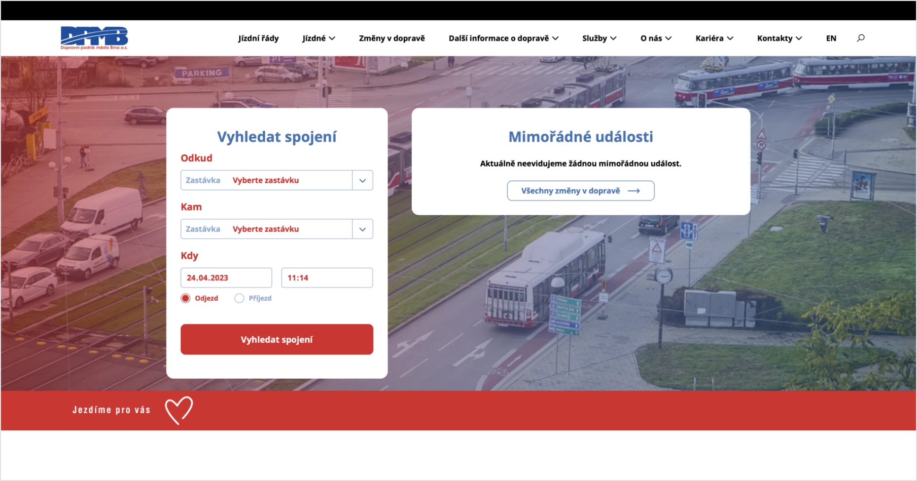
Website of Dopravní podnik města Brna
We created a website for the transport company that represents the company, is easy to use and serves as a reliable guide for travelling by public transport.
- Projekt: Roman Kučera
- UX, design, copywriting: Tereza Ticháčková
- UX, design consultant: Ivan Kebeleš
- Backend: Jan Polzer
- Frontend: Lukáš Polzer
Dopravní podnik města Brna
Dopravní podnik města Brna (DPMB) is the second largest transport company in the Czech Republic. It carries around 300 million passengers a year.
Client’s requirements and our role
The website that the company has been working with so far is ten years old and was in dire need of an upgrade. We first met with the client over the analysis of the original website. The decision to create a completely new website followed. We managed to win the tender. We gradually designed the information architecture, UX, content and design, and we coded the website on the Drupal content management system.

Initial situation
The original DPMB website dates back to 2013 and was created from the company’s in-house resources. Over the years, a number of new information and features have been added. With constant updates, the website has become very complex, confusing and difficult to navigate. The website was unfriendly to both visitors and the company employees who were responsible for updates.
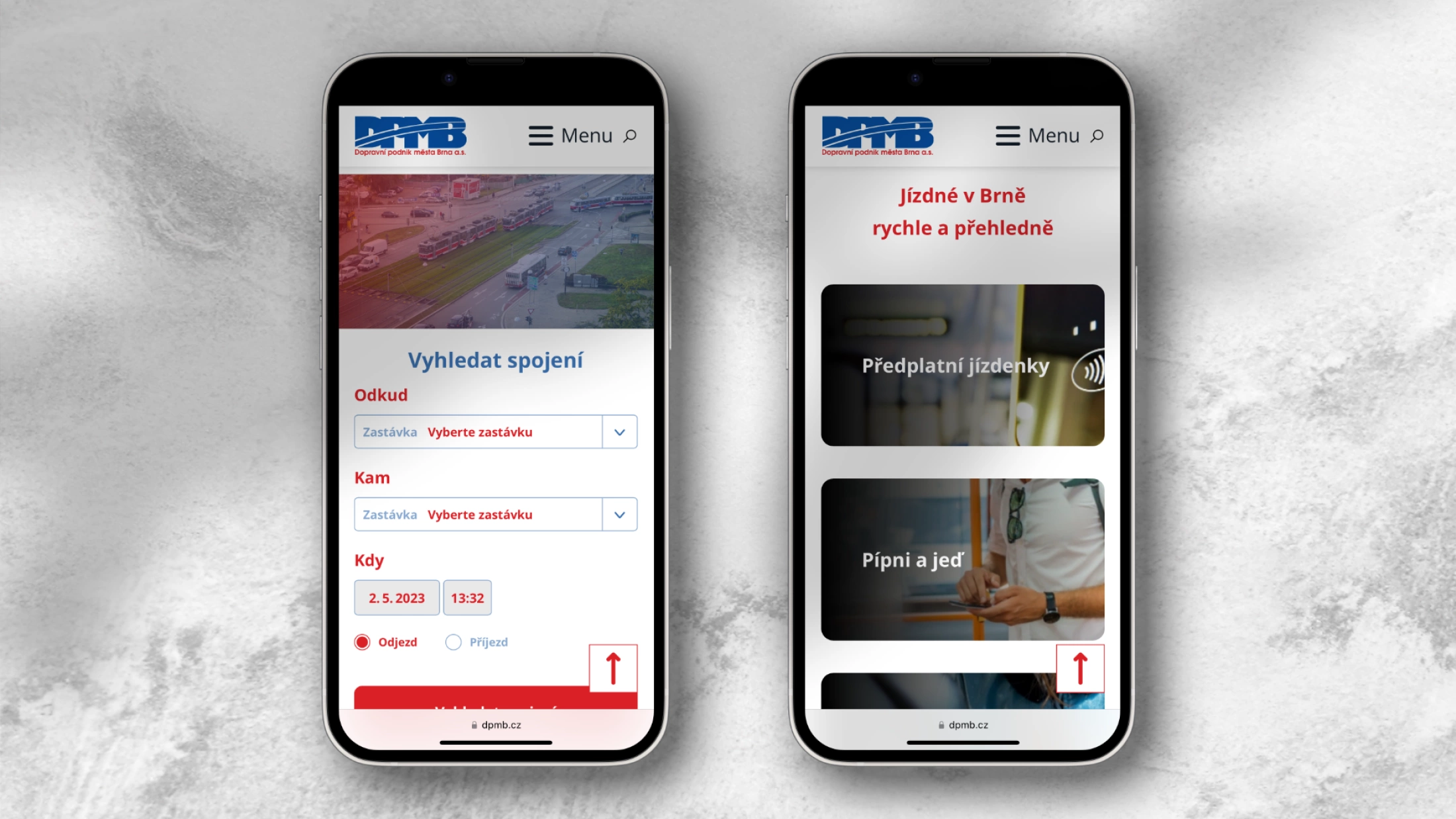
There was also no corresponding responsive version of the website which has become a big problem with the proliferation of mobile devices.

Analysis of & research
As part of the analysis, we examined the traffic to each section and sorted the most important information. The main task of the analysis was to find out what information travellers are looking for on the site and how they interact with it.
The original site was divided into several sections (Transport, Fares, etc.). The analysis showed, among other things, that in each section there are usually one or two highly visited pages, while the others are visited by less than 1% of users.
We also closely monitored the insertion process of new information and the system of web servicing by DPMB staff.
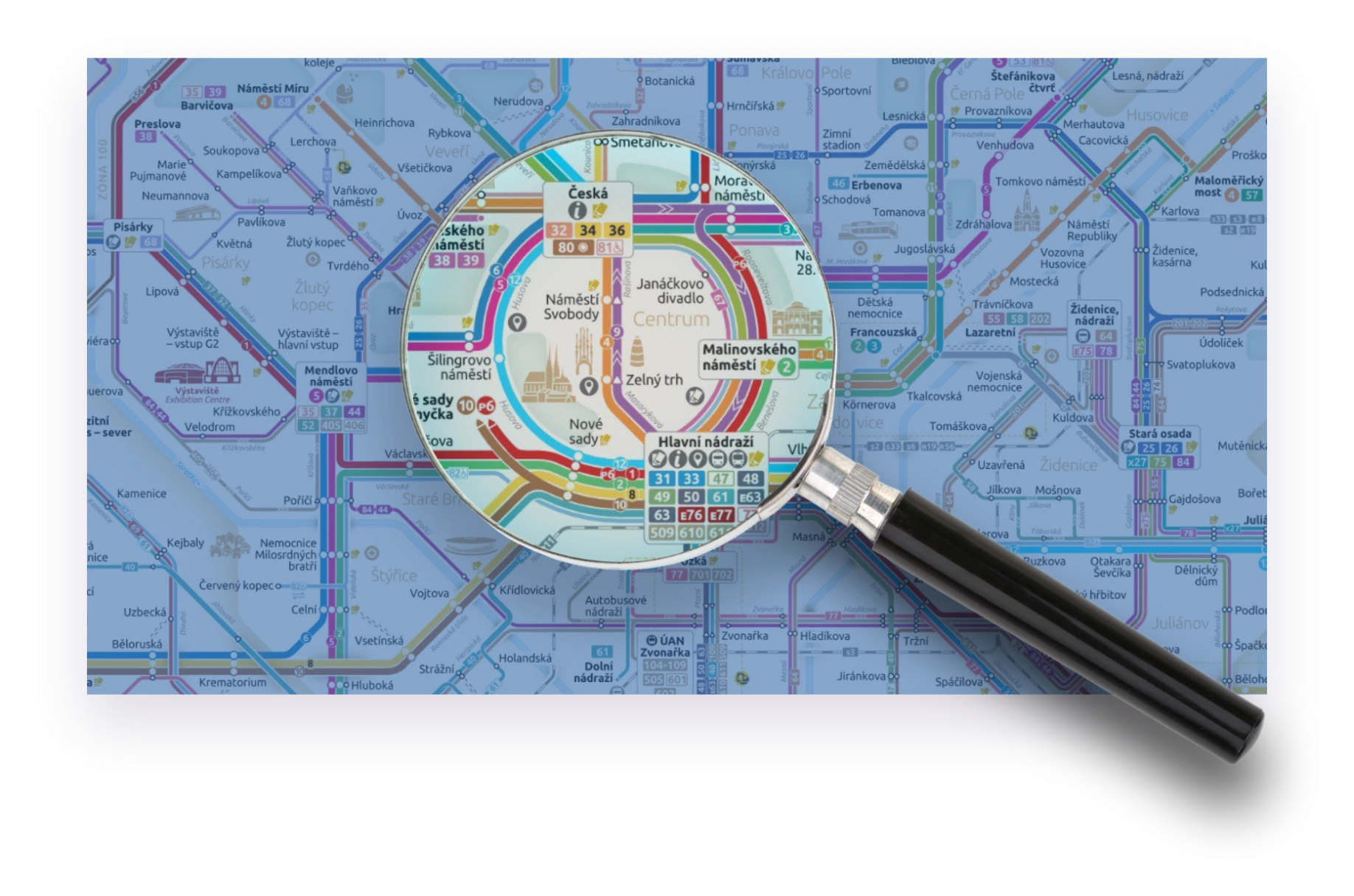
New structure and UX
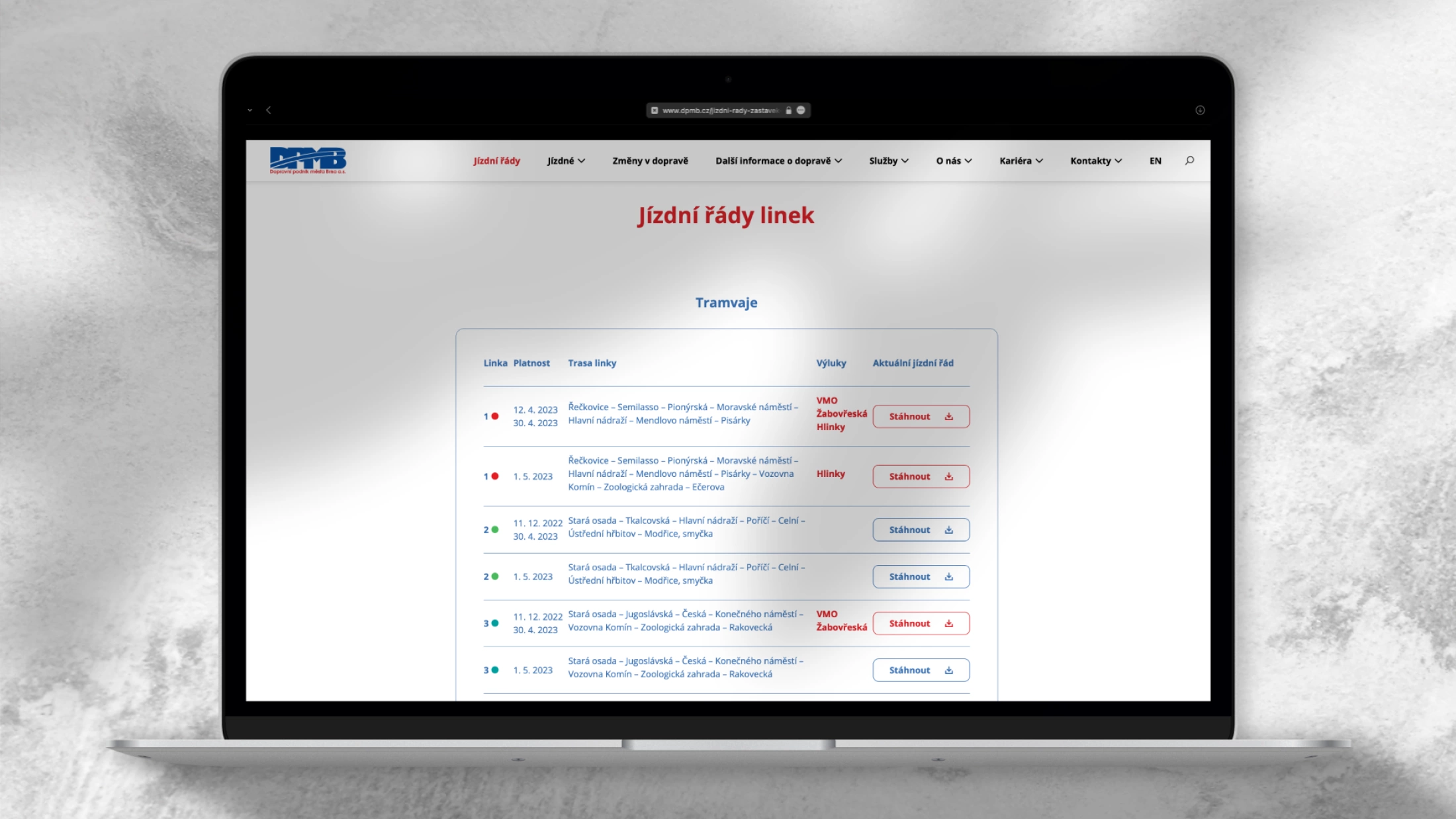
The results of the analysis were used in the preparation of new information architecture. We narrowed down the number of pages and sorted the information in a completely different way. Some sections were split up, some disappeared completely or became part of others.
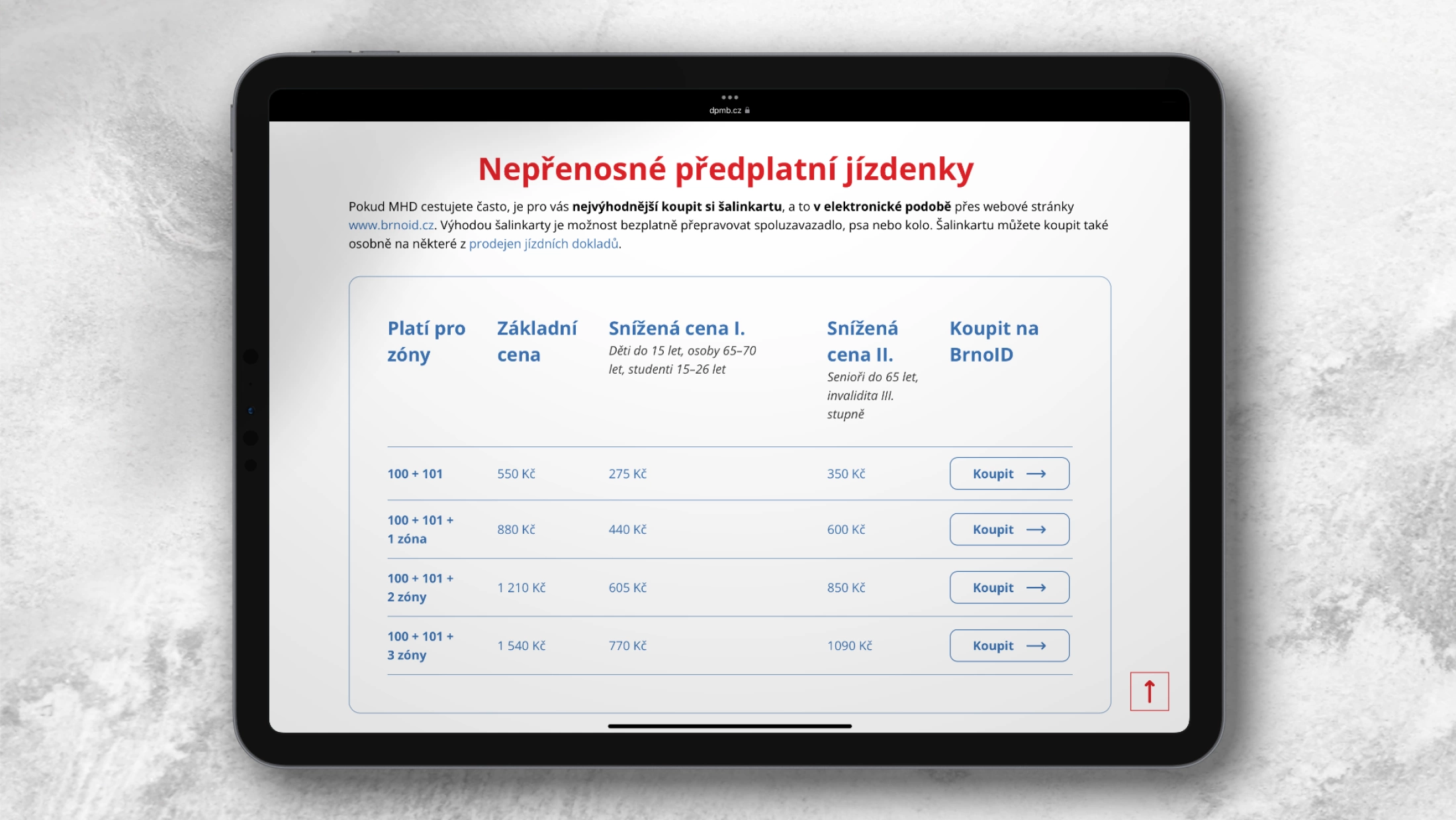
We also created a system for frequently asked questions on individual topics (e.g. Electronic Shuttle Tickets, Printed Tickets, etc.). This helped to gather all the information needed in one place, in a clear format that is easy to maintain, edit and add to.

Design for all target groups
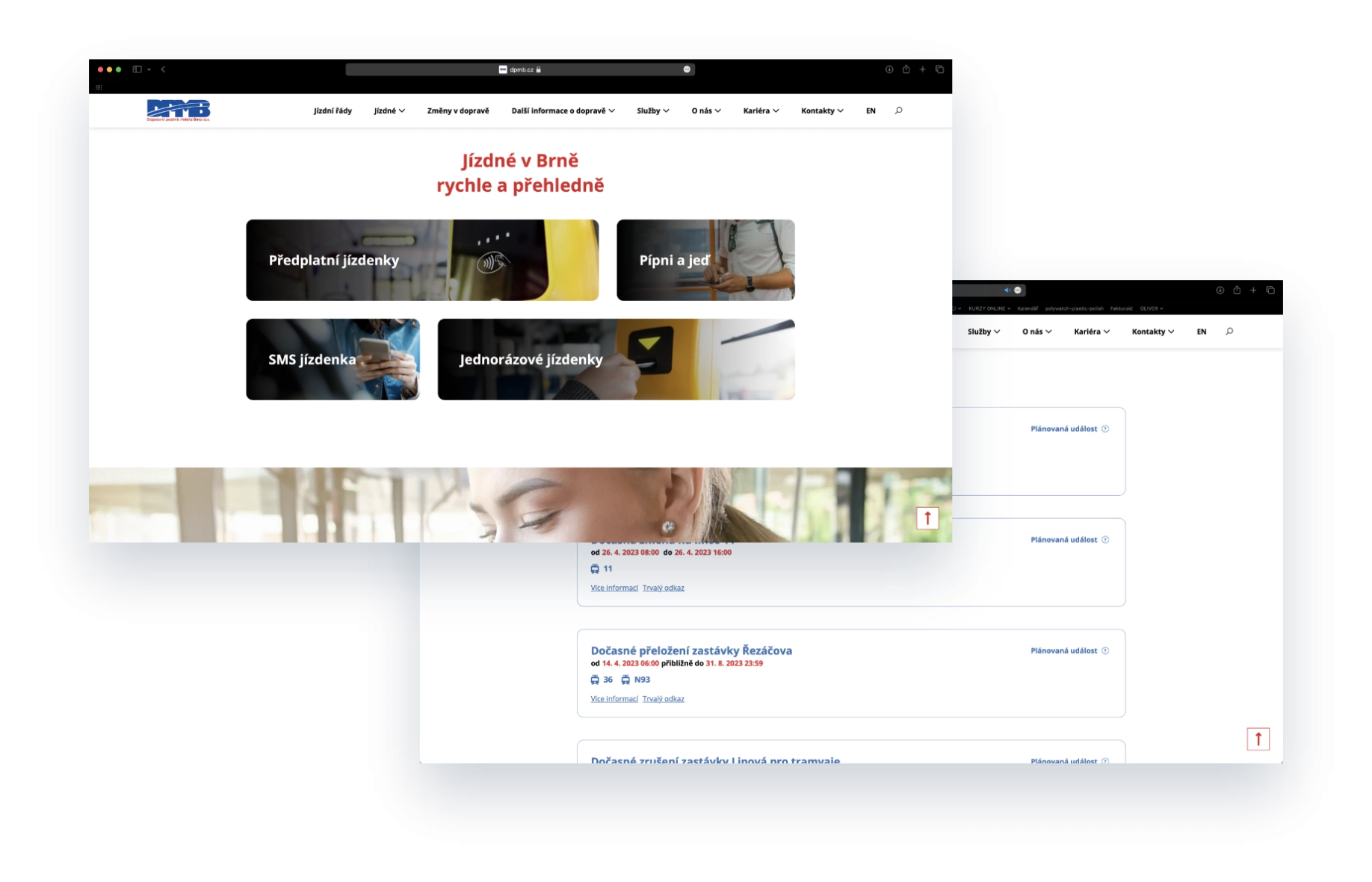
When designing the look and feel of the website, we gave priority to visual minimalism. Traffic information plays a major role on the site and the design aims to highlight it, not drown it out.
An important condition for the graphics was also the consideration of all demographic groups of public transport passengers. The website had to be clear, simple and easy to read even for seniors or visually impaired.
The web thus works with relatively large elements, airy content blocks and easy-to-read fonts. It is optimised for the use of specialised reading devices and more accessible for users with impaired vision.
Emphasis on development and innovation
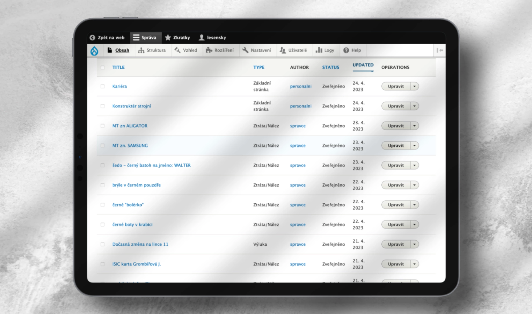
We based the website on the Drupal system. The biggest technical challenge was preparation of the administration for the employees and connection of the website to the original DPMB information system. Thanks to perfect communication with the Traffic Information Department, we managed to not only connect the interface, but also to improve and enrich it with new elements.
We simplified and improved the process of entering emergencies and updating timetables for company employees. System administrators gained much clearer interface to work with and an improved system for sending out newsletters.
We newly prepared an emergency filter for passengers and reliable full-text search.
Results & reviews
We created a representative, highly functional and easy to navigate website. The data shows that passengers can easily find what they need on the website. As a result, they spend less time searching on the website and by calling the DPMB information line. User testing also shows that they perceive the site as attractive and interesting.
Employees praise the servicing of the website, which makes their work easier and speeds up the publication of important information. In relation to partners, DPMB has acquired a representative website that promotes respect and goodwill for its brand.

Illustration
Our new website is easy to use, can be modified and developed according to current requirements, but above all it is modern and clear.
Ing. Miloš Havránek, Managing Director of DPMB
Kontakt
Spojte se
s námi!
Využijte sílu konceptu PR 360®. Společně s vámi vytvoříme nový skvělý web, který podpoří váš brand i byznys.